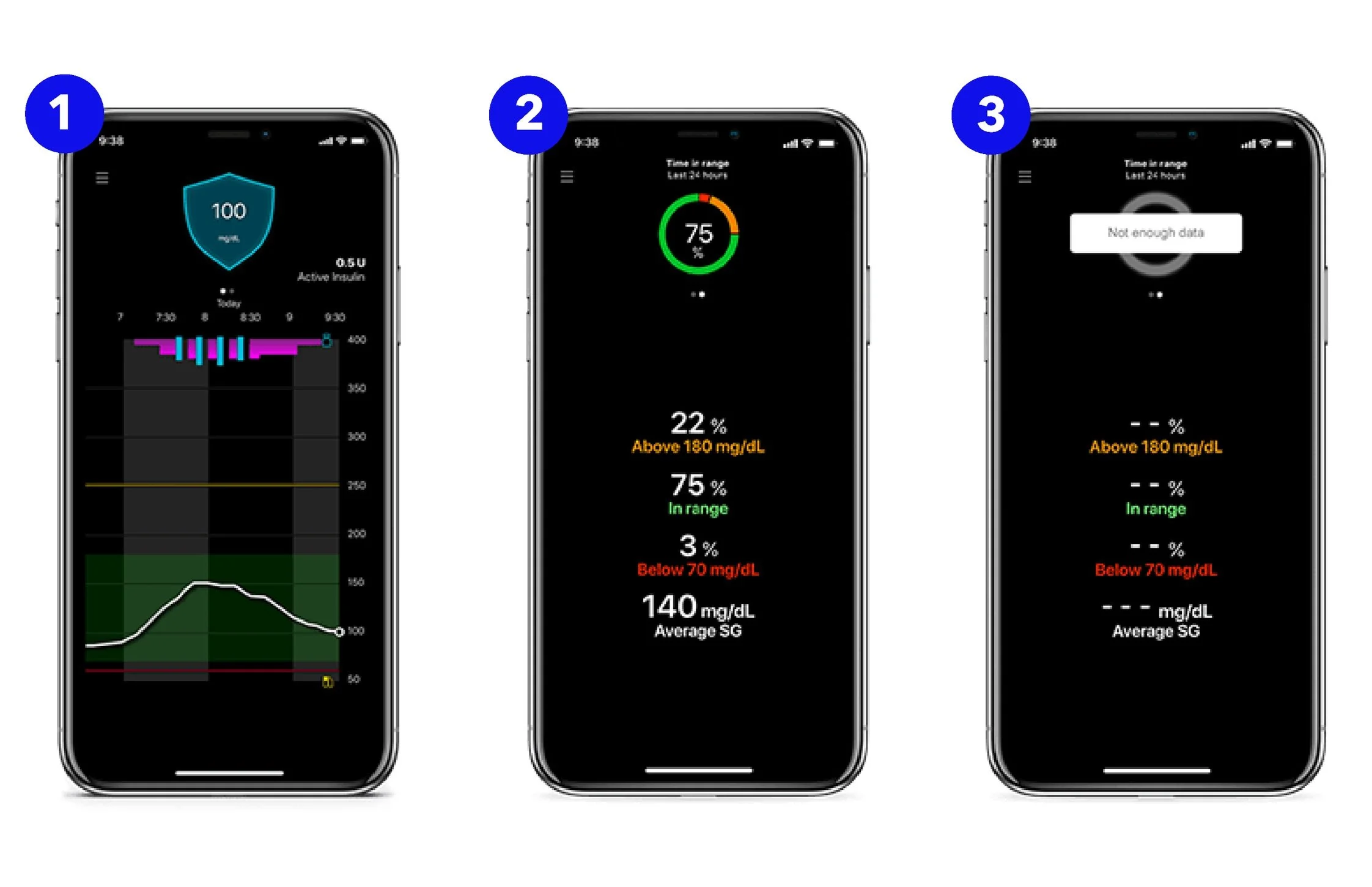
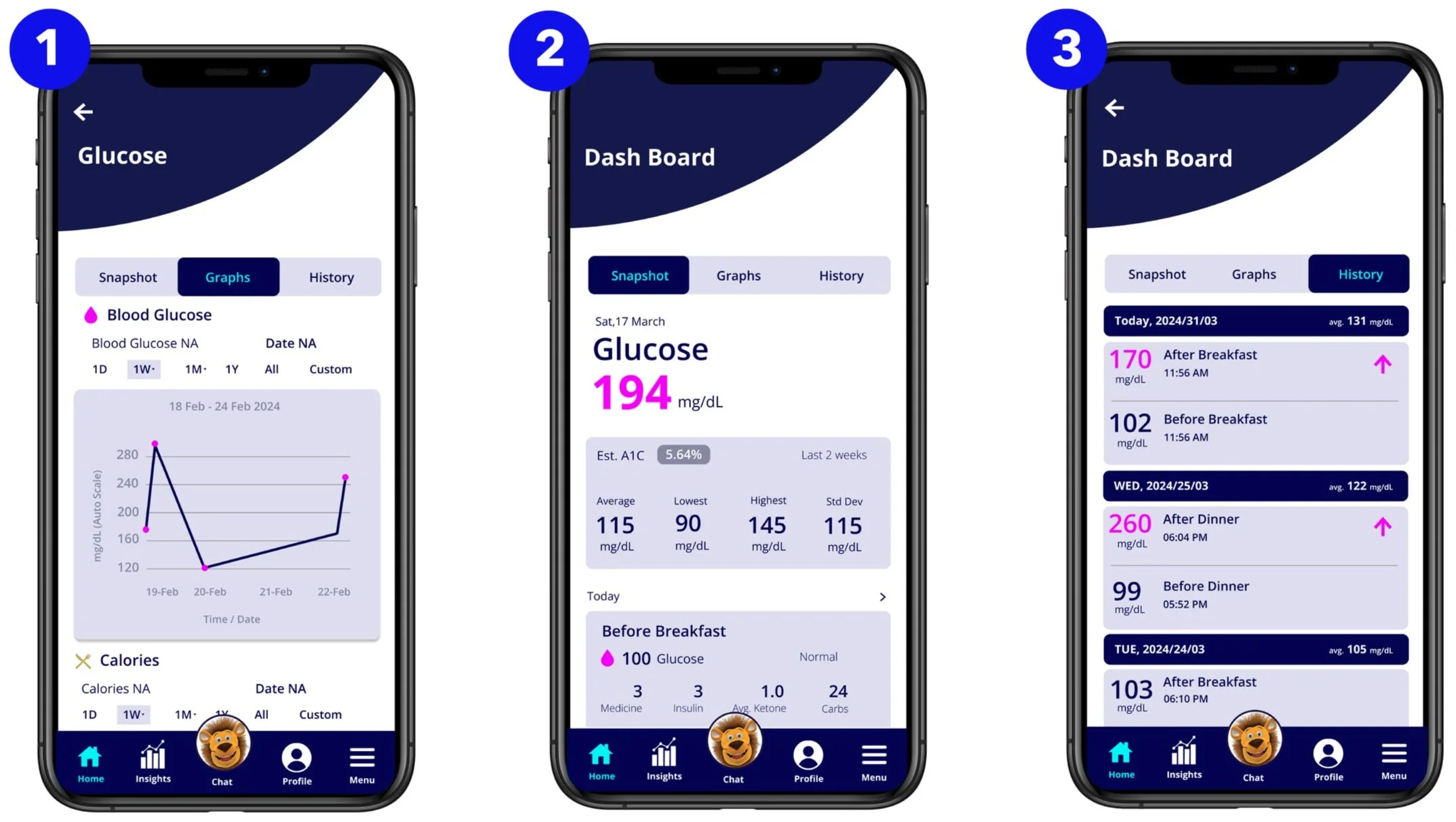
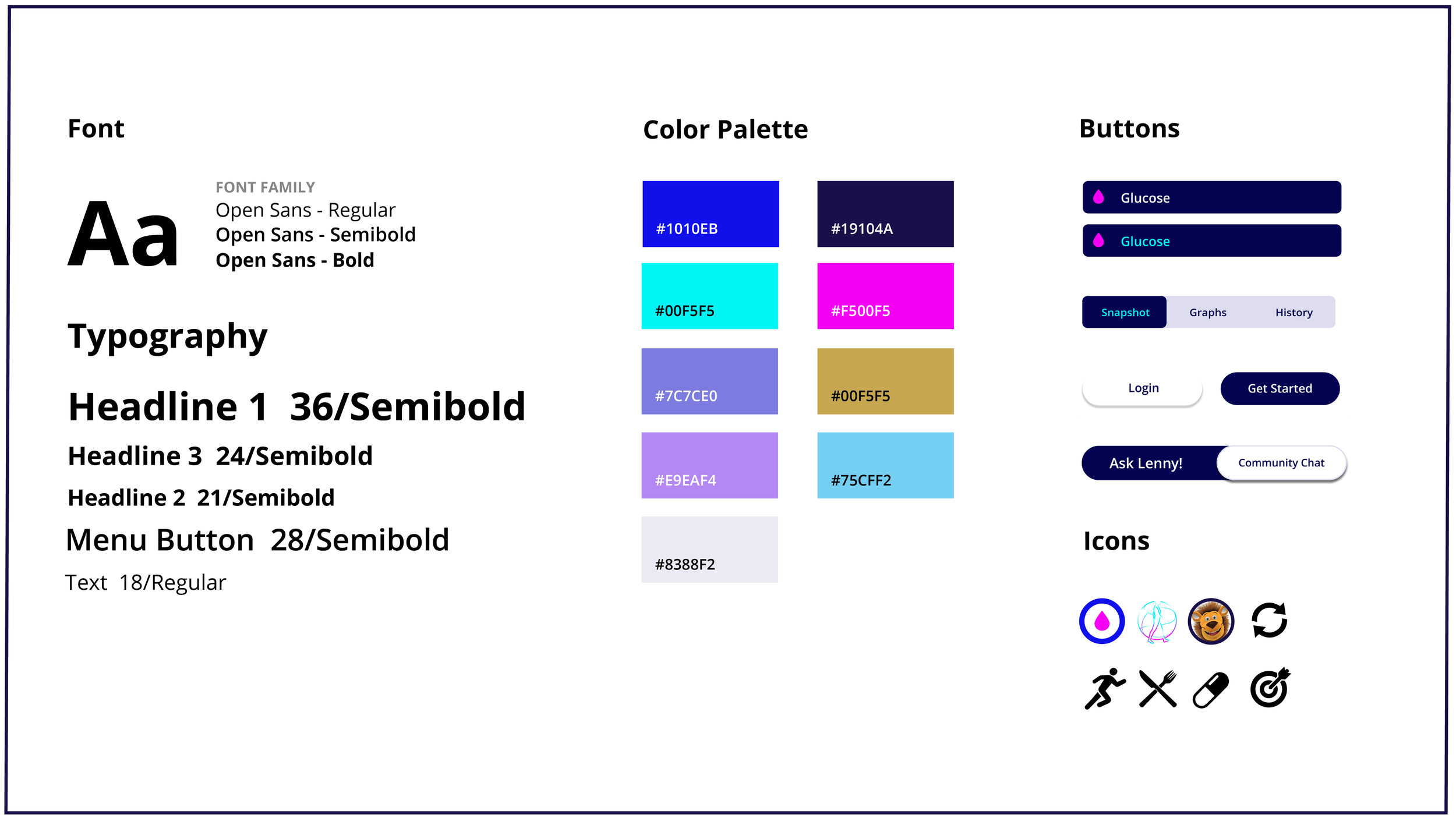
My top priority while creating this app redesign is to provide improved legibility and easy navigation. In the top menu section, I prioritized core features into 3 categories; Snapshot, Graphs, and History, for user to keep better track of their daily Diabetes regimen.
In the Graph section, I created a monochrome color scheme for better visibility and improved legibility. Also, I added a date range feature, from 1 day to a year, that lets the user customize their data, and track their blood glucose levels in real-time.